02Private Investment Platform BetaShipped
How do you build a private investment platform in three months that makes advisors believe?
I led 0→1 product direction and design for a private investment platform Beta. We built a portfolio recommendation system that considered client goals and holdings, sparking the company's first-ever investment transactions, ahead of schedule.
Role: Principal Product DesignerDuration: 3 monthsTeam: Product Designer, Eng Team, Team Leads
Beta goals
Surpassed

Problem
A private investment startup needed a Beta in three months. The company's competitive strategy was to deliver the best UX in the market. The only clear requirement was an intelligent recommendation of private funds, tailored to each client's goals and current holdings.
Key insight
Advisors do not separate 'learning about investments' from 'deciding to invest.' A rigid two-track experience would create friction at the exact moment users were ready to act.
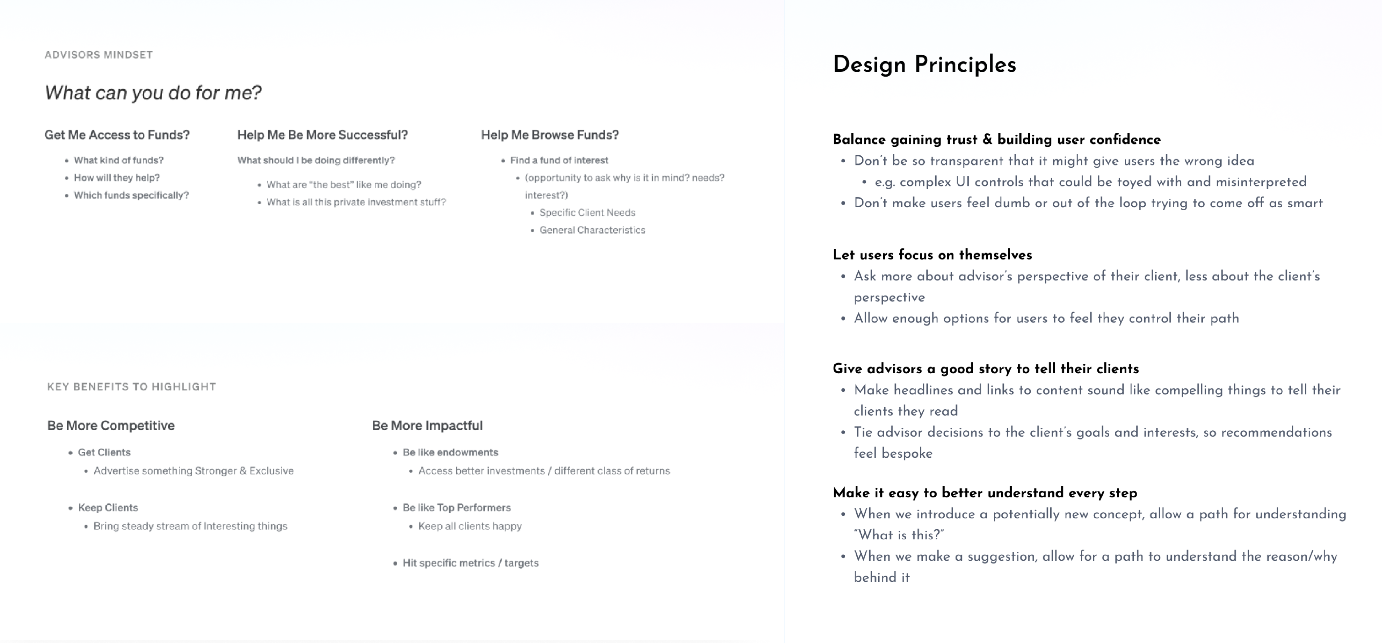
I started by immersing myself in the problem space, watching videos from early concept research, interviewing internal experts, and running my own generative research sessions with advisors. From those sessions, I drafted lightweight design principles and documented user motivations that became a reference point to inform quick decisions.
Working closely with the co-founders, we identified the key benefits the platform needed to deliver for advisors. I then envisioned three potential systems for how the product could both teach and generate a recommendation, constructing high-level flows for each option. We converged on a flexible approach: users could pivot in and out of a "learning mode" throughout the recommendation flow, rather than drawing a hard line between learning and acting.
Principles and flows
I outlined lightweight design principles early to keep the team anchored. I also created three high-level flows to help us converge, each representing a different stance on how teaching and transacting should relate to each other.
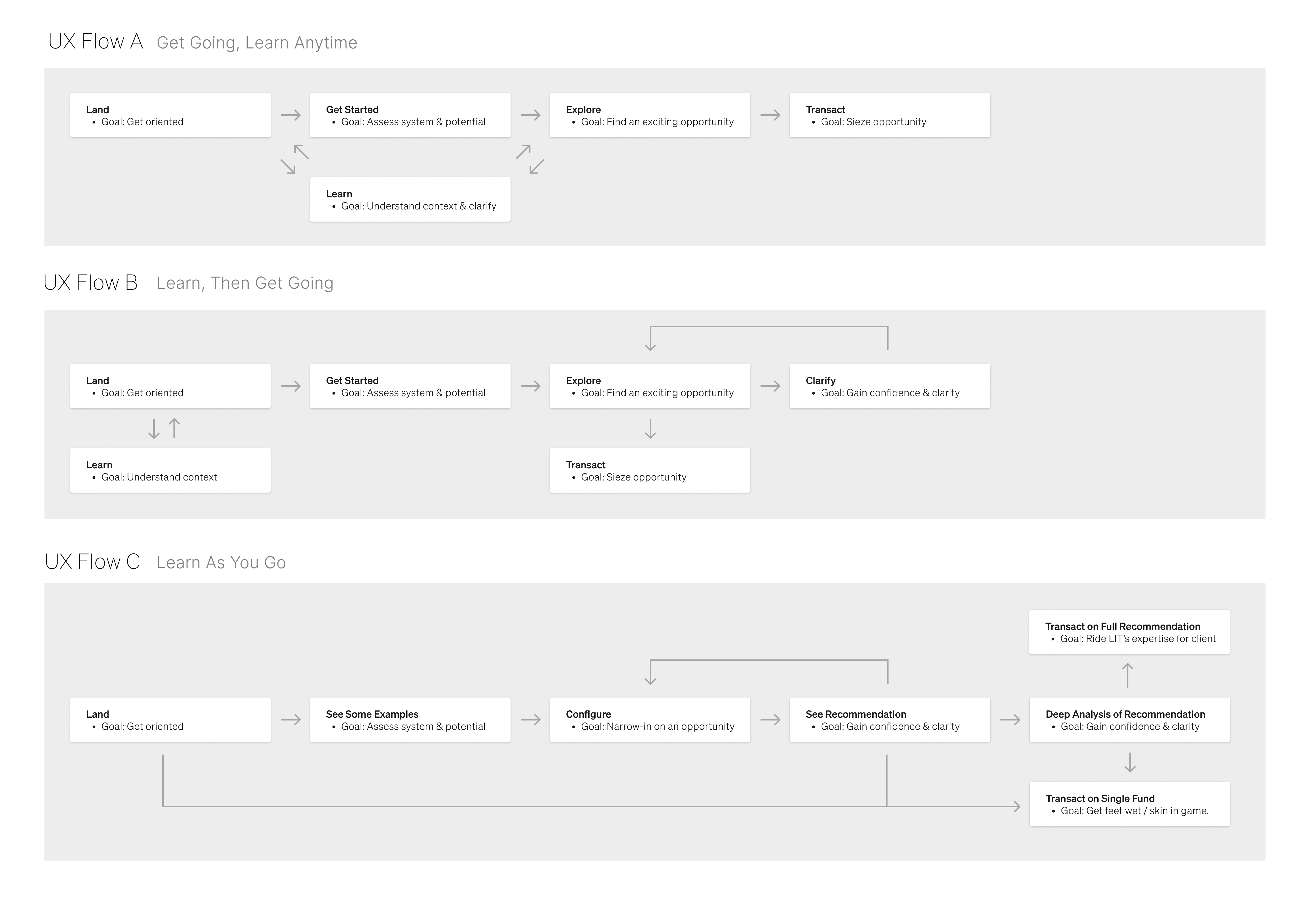
question we faced
Should the 'learning' experience be a separate track from the conversion flow?
Options we considered
Separate tracks
Cleaner structure, but creates friction when advisors are ready to act mid-exploration.
Flexible integration
More complex to design, but matches how advisors actually think, learning and executing simultaneously.
What we chose and why
We converged on a flexible approach that let users pivot in and out of learning mode throughout the recommendation flow. Advisors could explore example portfolios, then customize without losing their place.
What we learned
In expert-facing products, the journey between understanding and action is rarely linear. Designing for that fluidity made the product feel like it understood how advisors actually work.
Designing the form
What started as a few questions grew considerably as we iterated with internal experts. Each review surfaced another dimension of investment strategy that could be probed. Continuously navigating the balance between simplicity and comprehensiveness became one of the most important design challenges.
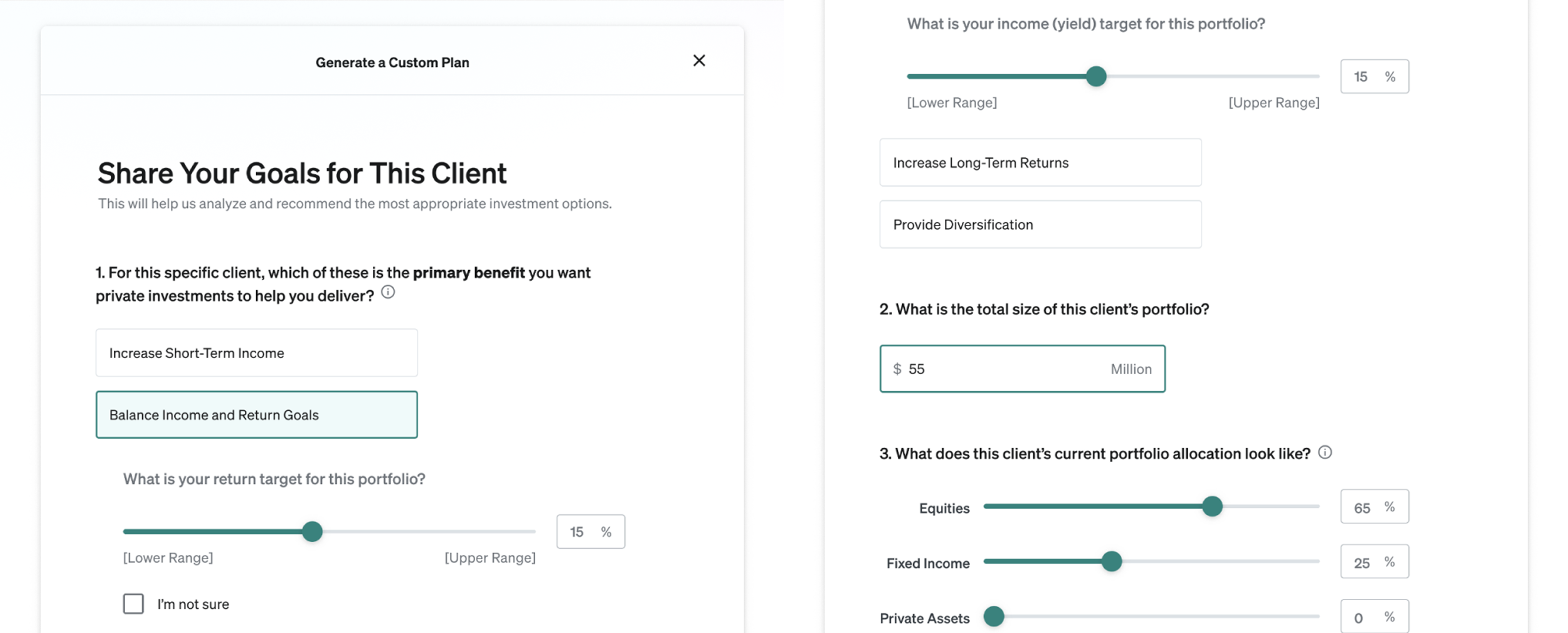
The recommendation form
Each iteration with internal experts added nuance. We preserved the approachability of the entry state while building in the depth that sophisticated advisors expected once they were engaged.
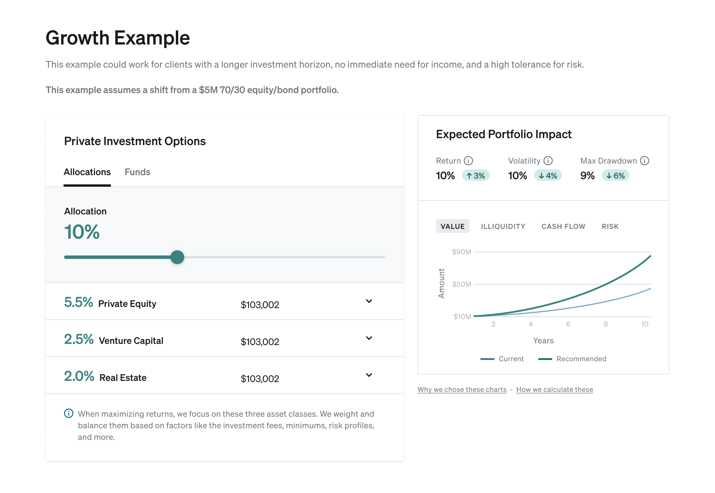
Iterating to clarity
As we iterated on the UI, one moment stood out: advisors were genuinely excited to see charts update in real time when adjusting a simple slider. That became a design anchor. We stripped away everything that diluted it, moving detailed context one click away into drawers, tooltips, and pop-up links until the core view felt immediately interpretable.
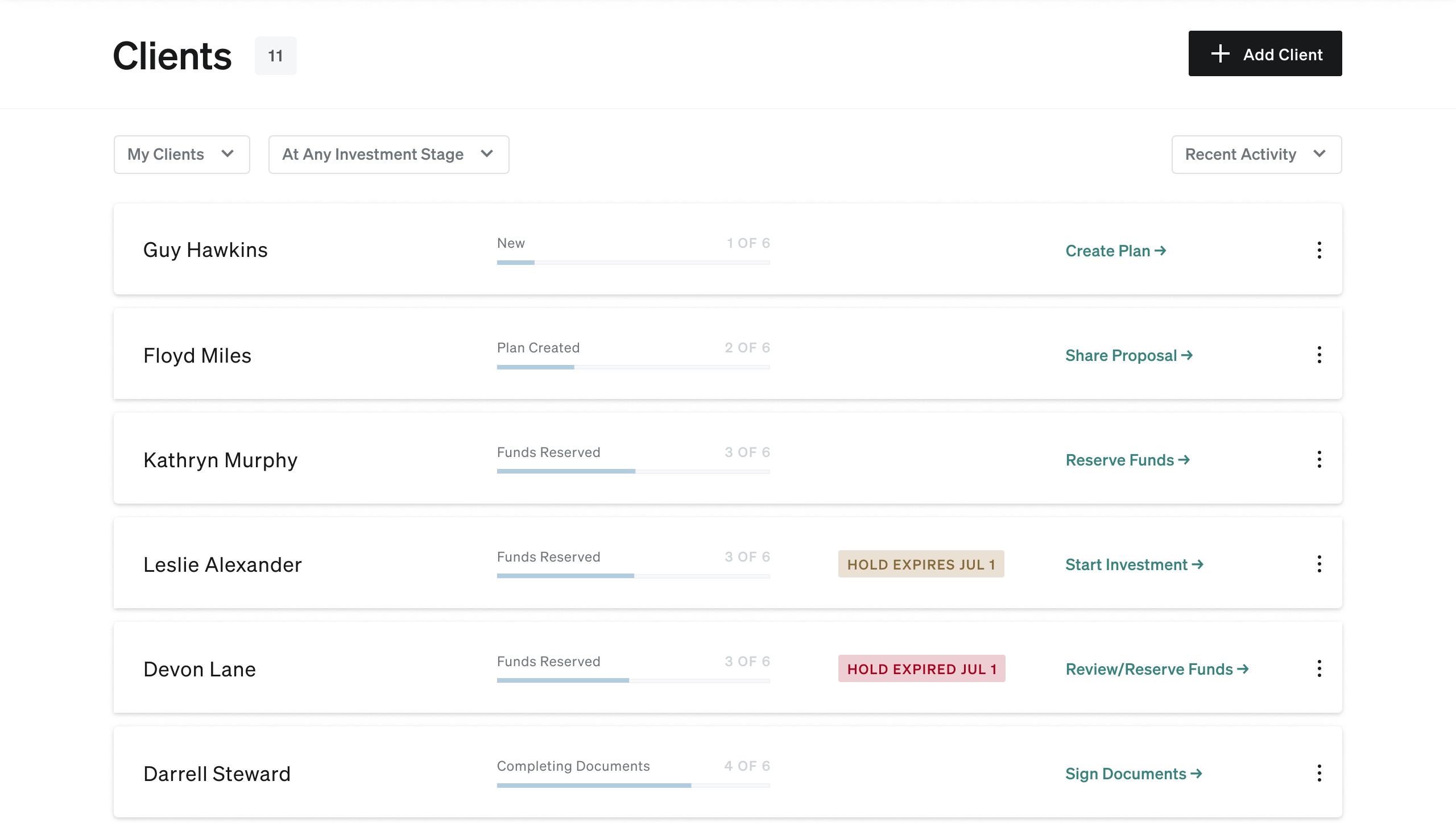
Managing multiple clients
With 100% of users eager to explore multiple custom plans, we needed a home for them. We created a simple client list with dynamic status indicators and a direct link to the recommended next action for each client.
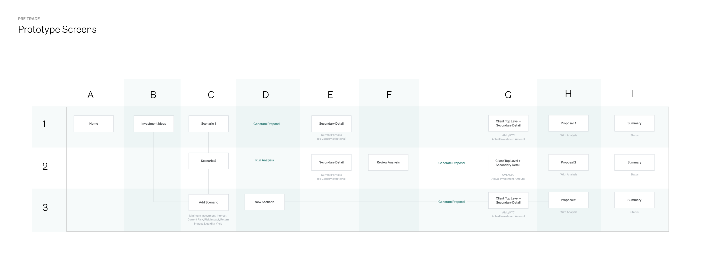
From map to prototype
I mapped out all the necessary screens for Beta and built a prototype that leaders and engineers could reference to understand the target experience as development began, and that we could take directly into user testing sessions.
What shipped
A clean, dynamic recommendation experience that advisors could interpret instantly, with a client list, interactive customization, and the foundation for a full investment transaction flow. The team moved ahead of schedule, and I mapped a six-month system vision and created a mood board exploring how the visual design could evolve.
Outcomes
first-ever transactions
Secured (early)
launch in 3 months
On time
Excited advisors
Dozens
Series A investment
Increased
Reflection
- The hardest challenge in expert-domain design is negotiating the balance between user experience and analytical rigor. Clear and honest communication about risks and ROI was key.
- Prototyping early and using it in stakeholder reviews compressed decision cycles significantly. It was more valuable as an alignment artifact than as a testing tool.
- A Beta is a complete product. It is a confident proof of what the full product will feel like. That confidence has to be real, and it shows.
Next case study
Enterprise AI Answers Platform
AI source cleanup for enterprise
Discovery, concept exploration, and launch, for a semantic grouping MVP that drove organic adoption and unsolicited customer praise.