04Consumer Accounting PlatformShipped
How do you fix a product that scaled by helping users make mistakes?
Reconciliation was a systemic problem in QuickBooks, causing duplicate entries and incorrect top-line numbers. I led a multi-quarter initiative to overhaul how accounting worked; generating design principles, strategy, and a new UX.
Role: Principal Interaction DesignerDuration: 6 monthsTeam: PMs, Designer, Content Designers
Customers delighted
1,000+
Problem
Customers were unable to pull data into QuickBooks and reconcile it accurately. Users were frustrated by the differing approaches to the same actions and surprised by many errors in their top-level business numbers. Accountants were reporting that the data in QuickBooks often required tedious clean up of duplicates and unreconciled transactions. I was tapped to review and own changes to the entire experience.
Core tension
Our system was not quite as smart or simple as it appeared to users. Duplicates were quickly compounding. We urgently needed to put up guardrails, fix the root cause, and support reconciliation.

Near-term focus
Recreating the core infrastructure and creating new tools would take significant time and serious design work to get right. In the meantime, we had a team ready to act fast and slow the bleeding.
Guardrail: Banking feed alert
It was well known that the majority of users had duplicate entries, due to the many different ways data was coming in. To prevent this problem from growing, we inserted a friendly alert to the Banking feed, to slow users when they were likely about to duplicate a record.
Contextual guidance
For users who engaged, we followed up with guidance pop-ups to show them how to proceed. We didn't like using the word 'match,' as it was clearly confusing users. We were later able to replace it throughout the product, but in the meantime, we worked to clarify it in context.

Aligning on design principles
There were many internal experts with strong opinions about how all of this should actually work. I led a series of workshops to capture and align on design principles.

Principles and process
I worked closely with my Content Designer to synthesize hundreds of stakeholder notes, and created a series of design principles to guide the UI and content design. I created a presentation deck and shared it broadly with leaders and stakeholders. Illustrations were pulled from a repository of brand assets.
A concept to aim for
This process inspired strong ideas for improvement. I created a concept flow to visualize the ideal experience, where data would appear alongside its relevant context in the product, no longer siloed in a separate review area.
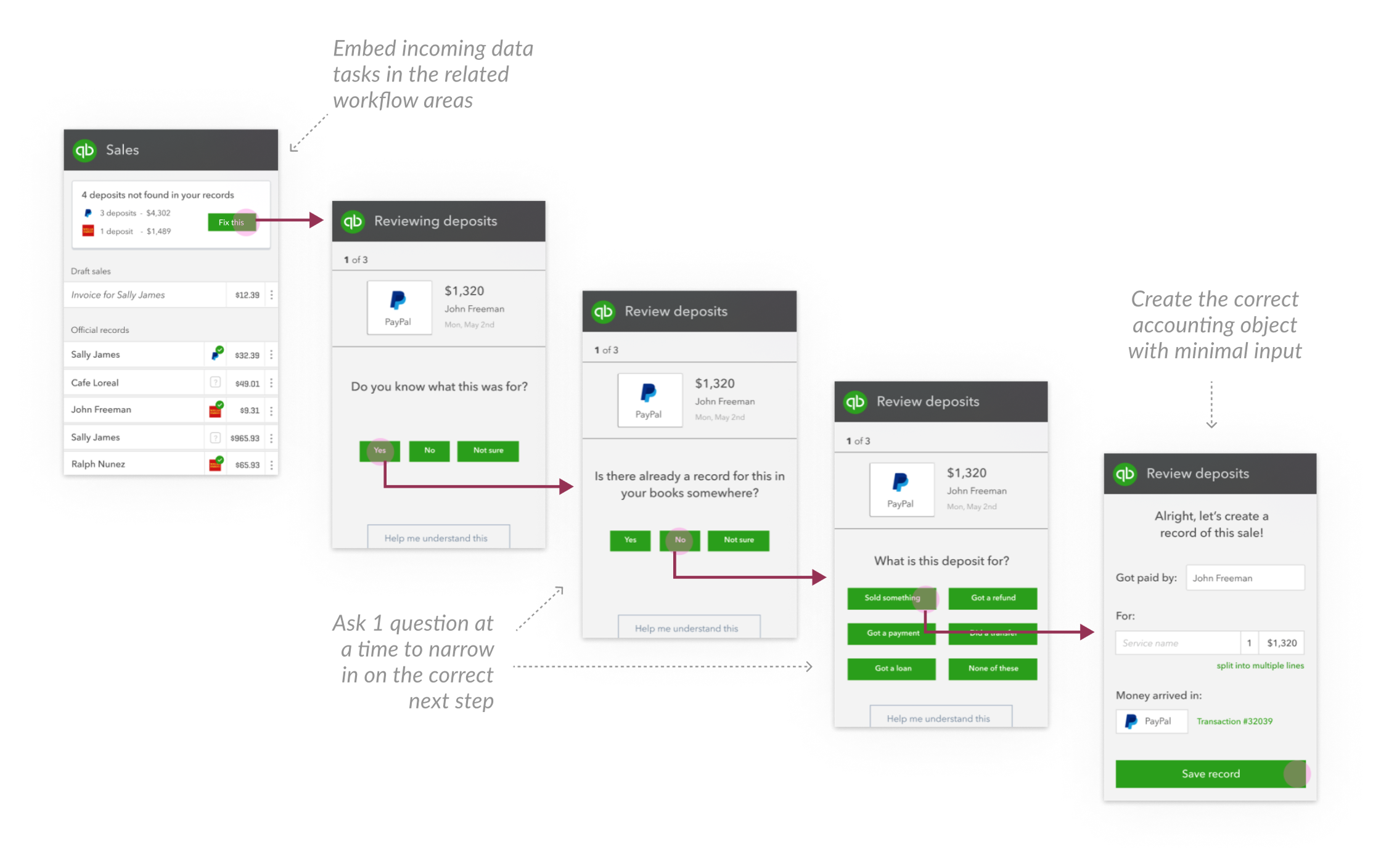
Proposed system vision
I also proposed a system where users would be walked through a series of simple questions and pointed to the correct next step. Users loved this simple direction in user testing sessions, and there were no concerns from stakeholders about the approach, but it would take some time to build the infrastructure. In the meantime, many users already had accounts full of duplicates and unreconciled transactions that needed addressing now.
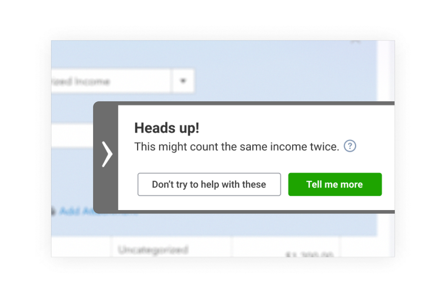
SmartCheck
We invented a tool to solve for the last-minute tax-time crunch, taking users through all of their incomplete and likely duplicate records one at a time. Through many explorations and iterations on content and UI, we landed on a simple, focused experience we called SmartCheck.


Monthly workflow tools
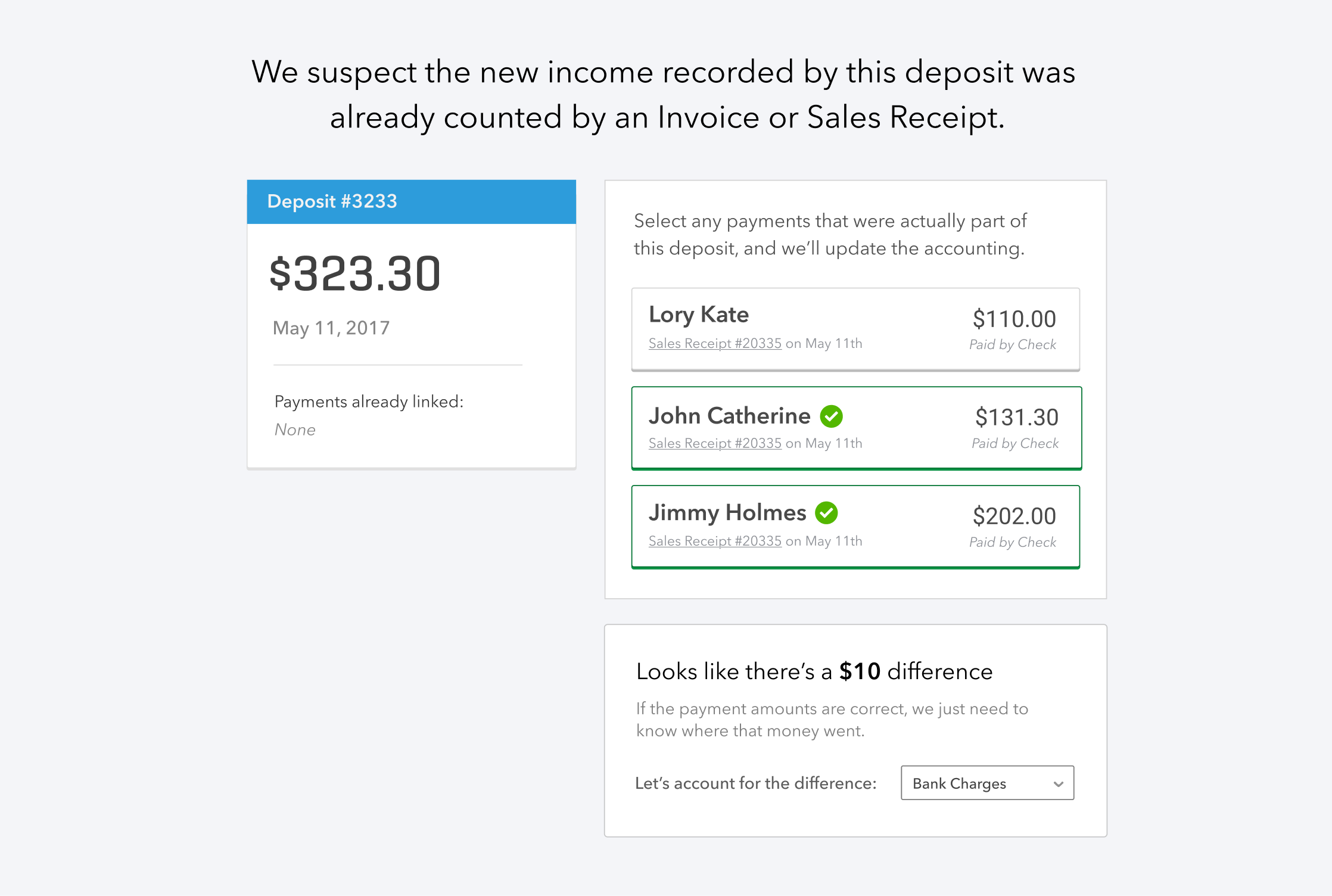
I devised a new tool for reviewing and reconciling records, but in order to keep it simple and map to the existing mental models, I split it into two tools, one for 'money-in' transactions, and another for 'money-out.' For the first time, users had a chance to visually see the linkage between bank transactions and other record types in the product, and intuit how and why they needed to be reconciled.
Key decisions
The most important parts of this work were the decisions that shaped how the product would scale, how teams would collaborate, and where the interface should stay quiet or become explicit.
question we faced
Should the cleanup tools be merged into a single workflow or separate features?
Options we considered
Single workflow
Lower scope, but doesn't match users separate monthly and annual routines.
Separate features
Higher investment, but creates lasting habits and prevents the problem from returning.
What we chose and why
We shipped as separate features: SmartCheck for the immediate tax-time backlog, and dedicated money-in / money-out tools to integrate reconciliation into users' regular routine.
What we learned
Addressing the immediate pain earns trust. Addressing the root cause earns loyalty. When possible, ship both layers.
Outcomes
Reduced errors
25%
Customers delighted
1,000+
Framework impact
Multi-year
Design principles adopted
Cross-org
Reflection
- Running alignment workshops first was the right call; it let us bypass entrenched opinions and move fast.
- Should have pushed for the in-context data vision to proceed in parallel — the cleanup work made it easier to deprioritize.
- Labels matter; Challenging conventions and driving new alignment was a lot of organizational work, but ultimately worth it.
Next case study

B2B Security & Compliance Platform
Agentic future of security reviews
Solo discovery and design that validated a new agentic tools and UI paradigm for security reviewers, estimated 1–2 hours saved per review.